Fidelity App: Not responsible for accuracy of financial information

Do you ever read the fine print when you install an application, and it presents you with an end-user-license-agreement?

I do.

Recently, I installed the Fidelity iPhone app, and here’s a few surprising parts of their service agreement:

By using the Services, I consent to the transmission by electronic means…. I acknowledge that Fidelity cannot assure the security or privacy of electronic transmission of such information. Any transmission may also be subject to other agreements that you have with your mobile service or access device provider. Accordingly, I must assess whether my use of the Services is adequately secure to meet my particular needs.

While all information accessible through the Services has been obtained from sources believed to be reliable, I understand that Fidelity will not be responsible whatsoever for the accuracy, timeliness, completeness, or use of any information received by it or received by me from Fidelity or any Provider through the Services and that Fidelity does not make any warranty concerning such information.

I don’t think most of us are capable of assessing whether our use of a third-party service is adequately secure — it’s difficult for security professionals to decide such things.

Tools and trade-offs

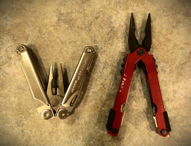
Ten or more years ago, I purchased a Gerber multi-tool. It was less expensive than a Leatherman, and it was painted in my favorite color. Since then, I saw my brother’s Leatherman Wave, and wanted one. For Father’s Day this year, Janice gave me a Wave. I like it — it’s a sleek piece of engineering in every way. The screwdriver fits more of the screws that I encounter compared to the bulky phillips head on the Gerber. The saw works far better. It’s easier to access the Leatherman’s knives, saw and file.

Leatherman Wave vs Gerber multi-tools

However, I’ve found that when I’m out and about in the yard, the Gerber is easier to work with. It’s belt-holster is secured with velcro — easy not only to open, but to close. And opening the pliers is an easy one-handed flick-of-the wrist, which means I don’t have to put the tool in my left hand down in order to open the pliers like I do with the Leatherman.

The Gerber’s pliers can be used to pry things apart. The Leatherman folds up when I try the same thing. The Leatherman is a more dangerous tool to open and use — more likely to pinch or draw blood (as it has done on a few occasions).

The tools definitely have trade-offs. I admire the Leatherman most, but for regular use, the Gerber wins.

The same thing is true of operating systems. I’ve used Linux and Windows for years, and have wanted to try out Mac OS X and a MacBook Pro.

My wish came true. For the past two months, I’ve been using a MacBook Pro 17″ with Retina display. Not only is the engineering and design gorgeous, the screen is eye-poppingly clear and crisp. The battery lasts and lasts, and the laptop doesn’t get too warm. The track-pad is the best I’ve ever used, and I love the gesture support to go forward and back in the web browser, and the gestures to switch desktop workspaces, activate Mission Control and Launch Pad.

Yet the keyboard shortcuts have taken some getting used to compared to the ones I know from both Gnome (Linux) and Windows 7. I find that it’s easy to accidentally hit Command-Q when I meant to hit Command-W. Control-Left and Control-Right don’t work — it’s Option-Left and Option-Right to jump forward and backward by a word. Home and End go to the beginning and end of a document instead of the beginning and end of a line. There’s no built-in window-snapping like Windows 7 or Gnome-Shell.

When I switch back and forth between Mac, Linux, and Windows, I hit the wrong keyboard shortcuts. Is it Command-C or Control-C for copy? On-and-on it goes — sharp edges. But I’m getting used to context switching. I love the MacBook Pro.

Last week, a Gallego UltraPro arrived from System76. It’s a compact powerhouse, and best of all, the keyboard shortcuts work like I expect, and I can get work done faster because I’m used to the underlying OS and tools. When programs break, I know where to look and what utilities to use to solve the problems (I love having /proc available). But the UltraPro with Ubuntu has sharp edges as well. The screen is a bit small, and it’s not as beautiful as the Retina display. It doesn’t have a backlit keyboard, and so far, I haven’t been able to get Evolution to talk to our Exchange server (which isn’t a problem on Mac because it has Outlook).

I admire the refinement, the visual beauty of OS X and the design of the MacBook Pro. For regular use in getting my work done, the UltraPro and Ubuntu currently win.

Debugging shell scripts, User Interfaces and compiled programs on Linux

When I want to debug a shell/bash shell script, I add the following to the script:


set -x
export PS4='+(${BASH_SOURCE}:${LINENO}): '

Other times, I export PS4 in my interactive shell, and run the script with “bash -x /path/to/script”. More bash script debugging tips are here: http://wiki.bash-hackers.org/scripting/debuggingtips

When I want to see what commands are being run on a Linux machine by a higher-level user interface, I turn to startmon. It shows me every process created, along with its arguments. This can be useful for figuring out how a CD/DVD-creation program calls wodim/cdrecord, or how it mounts a drive.

When I don’t have source code to a compiled program, and I want to see what system calls it is making, and check into why it might be failing to run, I use strace.

When I want to find out which programs are preventing me from unmounting a DVD or a USB flash drive, I use ‘lsof‘, which is available for nearly every UNIX-like operating system.

When I want to know what programs are consuming the most disk I/O and making things go slow, I use ‘top’ to see the top-memory consumers, and whether they have a high number of page faults. I use ‘iotop’ as well.

Fun and enjoyment when projects involve others

I believe we’re social beings, and that we succeed or fail based on the quality of our interactions with others. Such interactions introduce accountability and are educational and motivating.

Jake Edge reports that when Linus Torvalds was asked what motivated him to write Linux, the answer was that

If Linux hadn’t attracted other people right away, the project probably would have died within six months. But the involvement of others was a “huge motivating factor” for [Linus] to continue, because it “made it much more fun“.


OpenWest: Embrace your inner designer

During the first weekend in May, I attended the outstanding OpenWest conference, and enjoyed learning from experts. Among the most interesting sessions was one by Josh Broton titled, “Embrace your Inner Designer“.

Is design important? Yes. It changes how users see your application, how they use your application, and how they spread/recommend your application.

Think in flows, not in screens. Make a list of steps users take to use your application, and then do it yourself, and have your staff do it too.

  1. Users navigate to our site
  2. Users click login button
  3. User enters email address
  4. Enter password
  5. Click login button
  6. System validates credentials

The best marketing is FREE marketing. When your users recommend the app to others.

Design tips for developers:

  1. Use a consistent layout — use a grid system to ensure proper spacing.
    1. e.g. http://5by5.tv, http://panoetic.com
  2. Use white space! It helps users differentiate between objects. Less space creates groupings. It improves your readability and user retention.
  3. Use Color, Size and Positioning to convey importance.
  4. Be Consistent. Use one sans-serif font for the body on the screen. On paper, use serif fonts. On Retina displays, either is okay. Use one other font for accent. Use h1, h2 tags, etc. If you change the font you’re using part way through, it takes the brain a while to switch so that it starts comprehending again.
  5. Icons should only be used to add emphasis. This drives him crazy about mobile apps. If you must use icons, then be consistent, and adhere to UI standards.
  6. Color. Every color should consistently match an action. Remember that 10% of the world is colorblind. Use “Adobe Kuler” to help you pick good color palettes. There’s a CSS plugin to desaturate your website.
  7. Use typical casing. All UPPERCASE is extremely difficult to read. Use a non-monospace font. People use width to help them differentiate words.
  8. Left-align type and objects. Don’t center text or right-align.
  9. Steal/mimic ideas. “99% of creating is forgetting where you stole an idea from”
  10. Navigation MUST be easy. Proper nesting, breadcrumb navigation, and consider touch devices (which have no hover capability).
  11. Keep it Simple. Don’t make your users think. Ever. Buy the book — it’s great. by Steve Krug.
    • But you can let them access additional features or enable them.
    • Search engines may penalize you.
  12. Make action items obvious.
  13. Make important items stand out.
  14. Minimize noise
  15. Omit needless items. “The reduction to the essential has never led to catastrophe.” — Dieter Rams
  16. When in doubt, leave it out!
  17. Keep your instructions simple
  18. Test, test, test

Ask your users if they can do what they need to with your app. Don’t ask them whether your app does what it should.

Twitter bootstrap is awesome for non-designers. You can tell websites that use it because of their look, but that might be okay. (Wikipedia info here)

Audience question: Does Windows 8 suck?

Answer: For my mom, it’s perfect. The use of whitespace is great. However, people don’t like switching to a new design paradigm. He despises the complete and total waste of space in Metro.

Check out Font-Awesome — it helps you know standard icons to use in your application.

Experiencing Android on an HTC EVO 4G LTE

In January, I joined the bandwagon and bought a smartphone. I’m frugal, so I went with https://ting.com/ for my provider, and I’m paying about $15 per month for 100 minutes, 100 text messages and 100 MB data, and I don’t get reamed if I go over those limits.

I would have bought an iPhone, since I’ve been using an iPod Touch for the past two years, but Ting only offers Android phones. So I purchased the HTC EVO 4G LTE, which is an improved version of the HTC One X, although it has the dumbest name ever. It’s a fantastic smartphone, has a fantastic screen, and it shopped with Ice Cream Sandwich — the first release of Android that I’ve liked. Now it’s been upgraded to Jelly Bean, which is better in subtle and worthwhile ways.

What’s better with iOS (iPhone and iPod Touch)?

  1. Screen orientation change doesn’t delete data. This is a major black-eye on Android. Every time the screen orientation changes, the app’s UI is destroyed, and unless the developer took special pains, all data is lost. I’ve lost plenty of data (usually paragraphs of notes that I’ve entered with a bluetooth keyboard) this way with my Android, whereas with iOS, it wasn’t a problem.
  2. Universal media control on lock screen. FF, Pause/Play. If Jelly Bean fixes this, then I haven’t seen the fix because HTC’s Sense UI took it away.
  3. Screen orientation lock so that when I’m laying on the couch, trying to read, it will stay in the correct screen rotation mode. As a workaround, I have an app that locks the orientation.
  4. Peripherals. You’ll find a wide range of cases, keyboards, and peripherals for Apple i-devices at Target, Wal-Mart, Best Buy and elsewhere. Not so much for Android devices. Bluetooth peripherals (speakers, headsets, etc.) offer Android somewhat equal footing.
  5. Integration. Our Honda Odyssey integrates beautifully with our iPod Touch, showing album artwork on the in-dash screen, and allowing browsing and selection of albums. With Android, I can play my music over bluetooth, and that’s about it.
  6. Publishers. Everyone publishes content for iTunes and iTunesU.
  7. Easier to manage app notifications — it’s all in once central place. Jelly Bean introduced this ability, but it’s not in one central place. I disable notifications from any and all games. It’s unacceptable for them to bother me, ever.
  8. Updates. With an Apple product, you get operating system updates for three years. Not so with most Android devices. You’re lucky to get one OS update. The solution would be to purchase a Google-branded phone like the excellent Nexus 4, and then you will get two years of OS updates.
  9. It ships with a note-taking app by default.

What’s better with Android?

  1. I can limit data usage for the entire phone, and prevent individual apps from using mobile data. Since I’m using Ting, this is a big deal.
  2. Hardware connectors are cheaper (HDMI output)
  3. Widgets
  4. Google integration and authentication is SO much less hassle.
  5. WiFi Analyzer — is it even possible on an iPhone?
  6. AppLock Pro allows me to hand my Android phone to my children, knowing that they can only access the apps that I’ve allowed. Apple’s guided access is almost as good, but doesn’t allow me to define a range of apps they are allowed to use — it’s on an instance-at-a-time basis.

What’s better with the HTC EVO 4G LTE compared to an iPhone or iPod Touch?

  1. The larger screen makes reading content a much more enjoyable experience compared to my iPod Touch 4th generation.
  2. The EVO 4G LTE allows 32GB storage to be inserted.
  3. The battery is more easily replaceable.

Lessons learned:

  1. Most apps are fantastic on Android, just like on iOS: mint.com, Gospel Library, Pandora, Gmail, Dropbox, Kindle reader, Google Earth.
  2. A purpose-built digital camera is still better. Although I love the camera on the EVO 4G LTE, my Canon PowerShot takes better pictures.
  3. Gmail eats long-typed emails — ones that I type with my bluetooth keyboard. So I don’t trust gmail for anything but reading, searching, and short replies.

Here are my most used and favorite apps for Android:

A final note about ting.com: Although they do voice roaming on Verizon’s network when no Sprint tower is available, they never do data roaming. This means that when I’m out-and-about at my city library, or shopping, I don’t have a data connection. For the price, I’m willing to live with it. For a more expensive plan, yet more affordable than Sprint or Verizon, it would have been ideal to purchase a $300 Nexus 4 and use T-mobile as my provider.

Norton turns my computer into a snail

We’ve used Norton Online Family for well over a year in order to give our children’s accounts time and website restrictions. During that time, our five-year-old Vista computer became unbearably slow, and it’s been difficult to identify the culprit, since the I/O slowness is attributed to svchost.

My experience with other Norton consumer products has been poor, and so I guessed that by uninstalling their Online Family software, it might improve performance. Since uninstalling it, the computer feels at least twice as fast — for login and logout, for network file copies, etc.

I liked Norton Online Family’s functionality, but I couldn’t bear it’s performance hit to the user experience. Now I’m in the market for another solution. Do you have any recommendations?

Arstechnica: Use your phone as a document scanner

Arstechnica has an article about using a smartphone as a document scanner “in a pinch”. It’s fun to see the possibilities that technology opens up.

Seven years ago, I wanted to scan some journals for archival purposes. Using a traditional flatbed scanner would have taken far too long, and wouldn’t have worked well since the pages were bound. So I mounted my Olympus C-8080 digital camera on a tripod, added crude lighting from lamps, and quickly photographed the pages. It may not be perfect, but it’s better than nothing.

Content-centric networking with CCNx

This was an interesting topic to read about: Content-centric networking with CCNx:

Content-centric networking (CCN) is a novel approach to networking that abstracts away the specifics of the connection, and focuses on disseminating the content efficiently.

CCNx is the brainchild of PARC’s Van Jacobson, and if anyone is qualified to rethink core Internet protocols, Jacobson is.